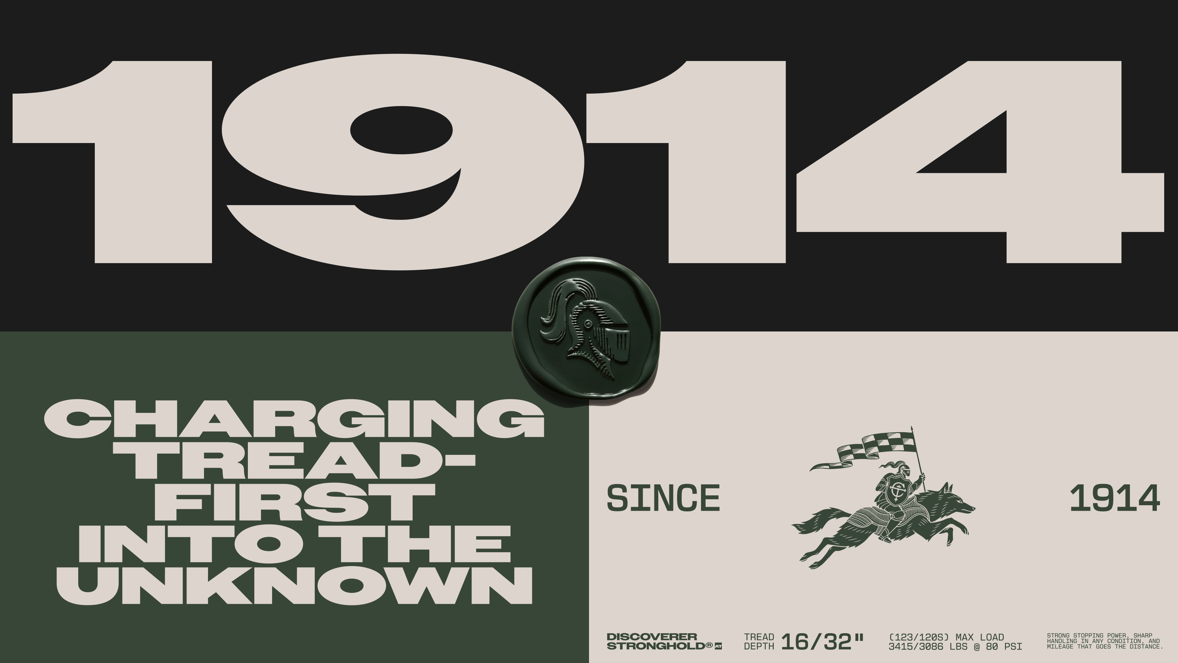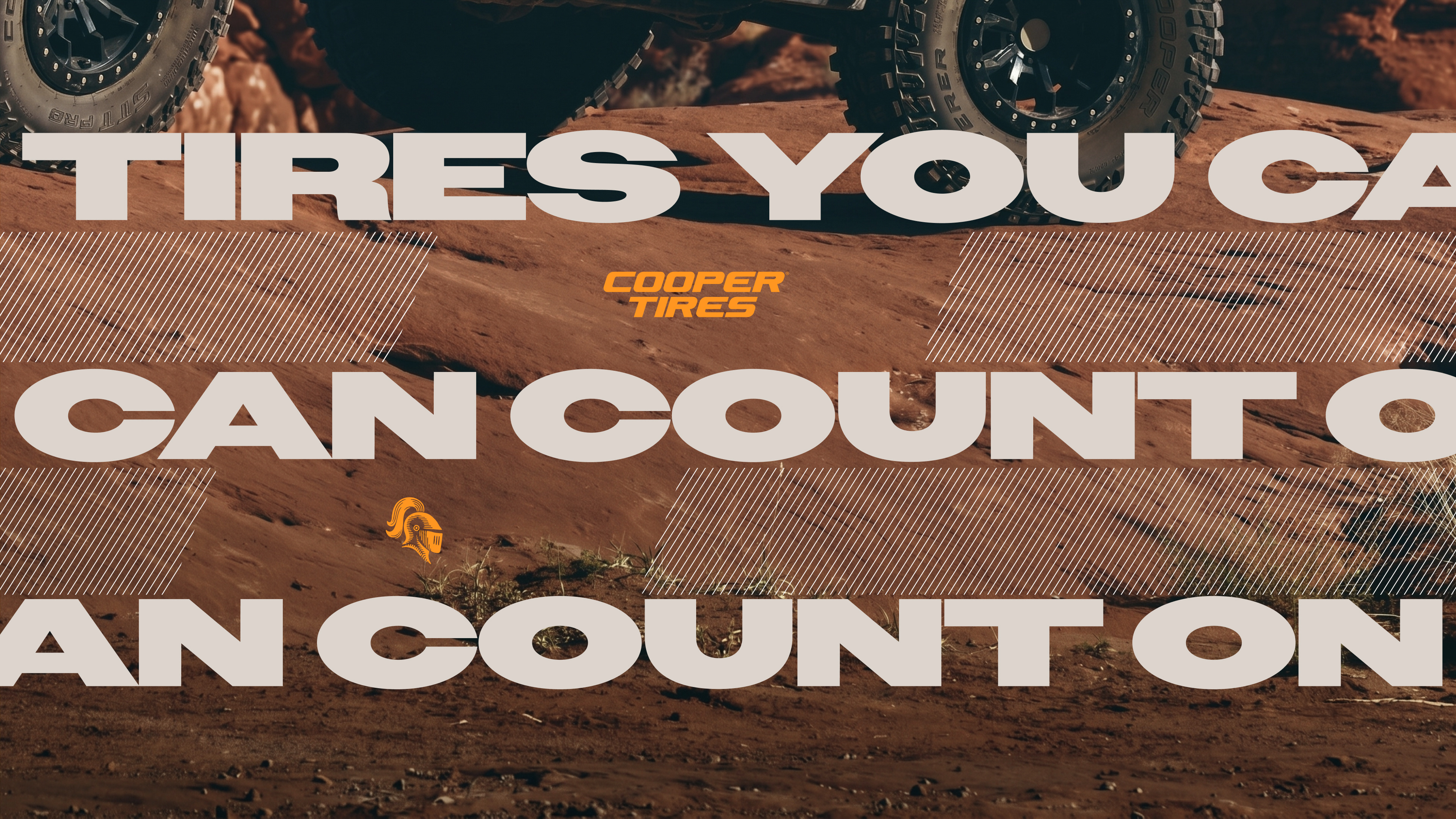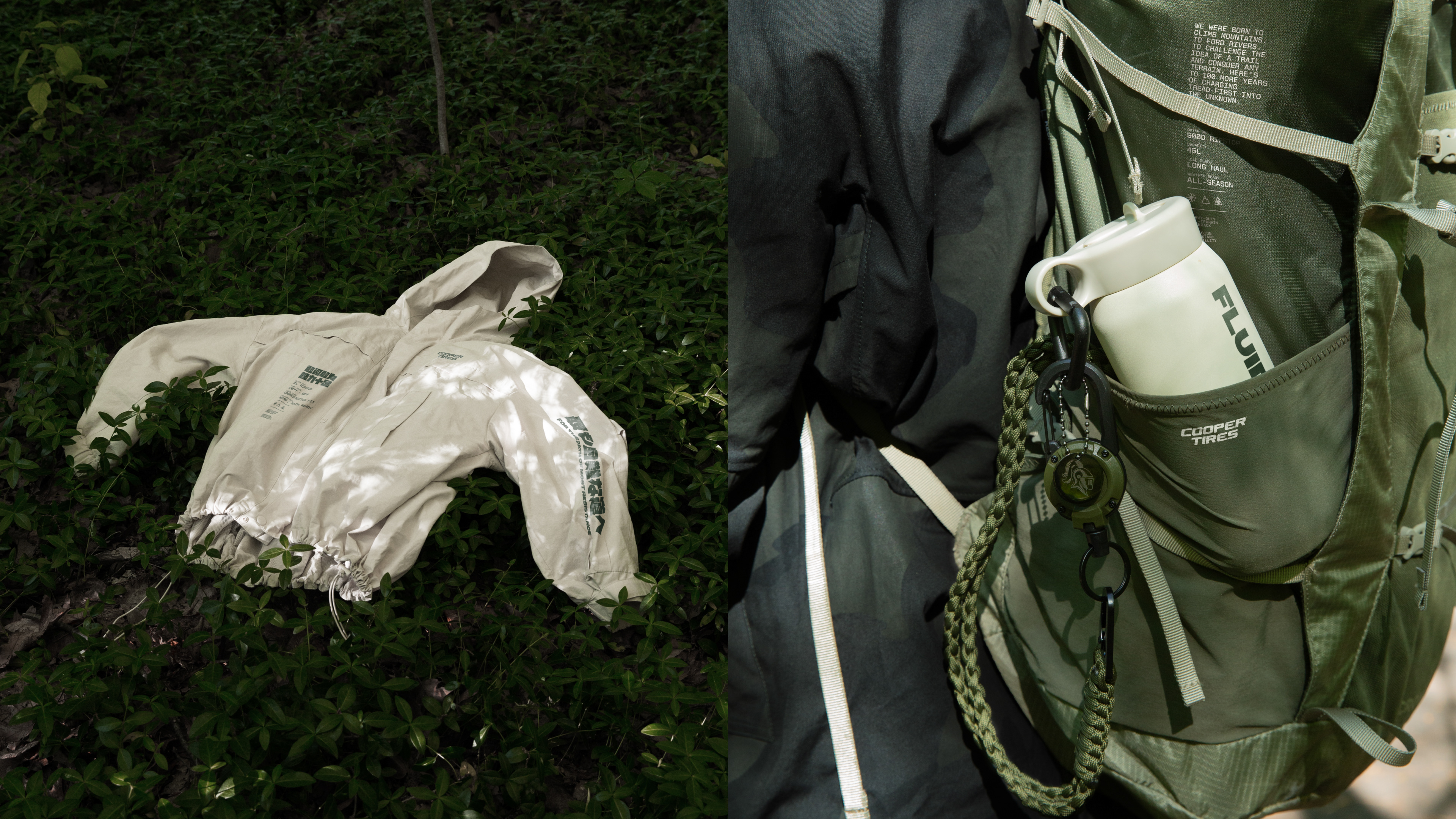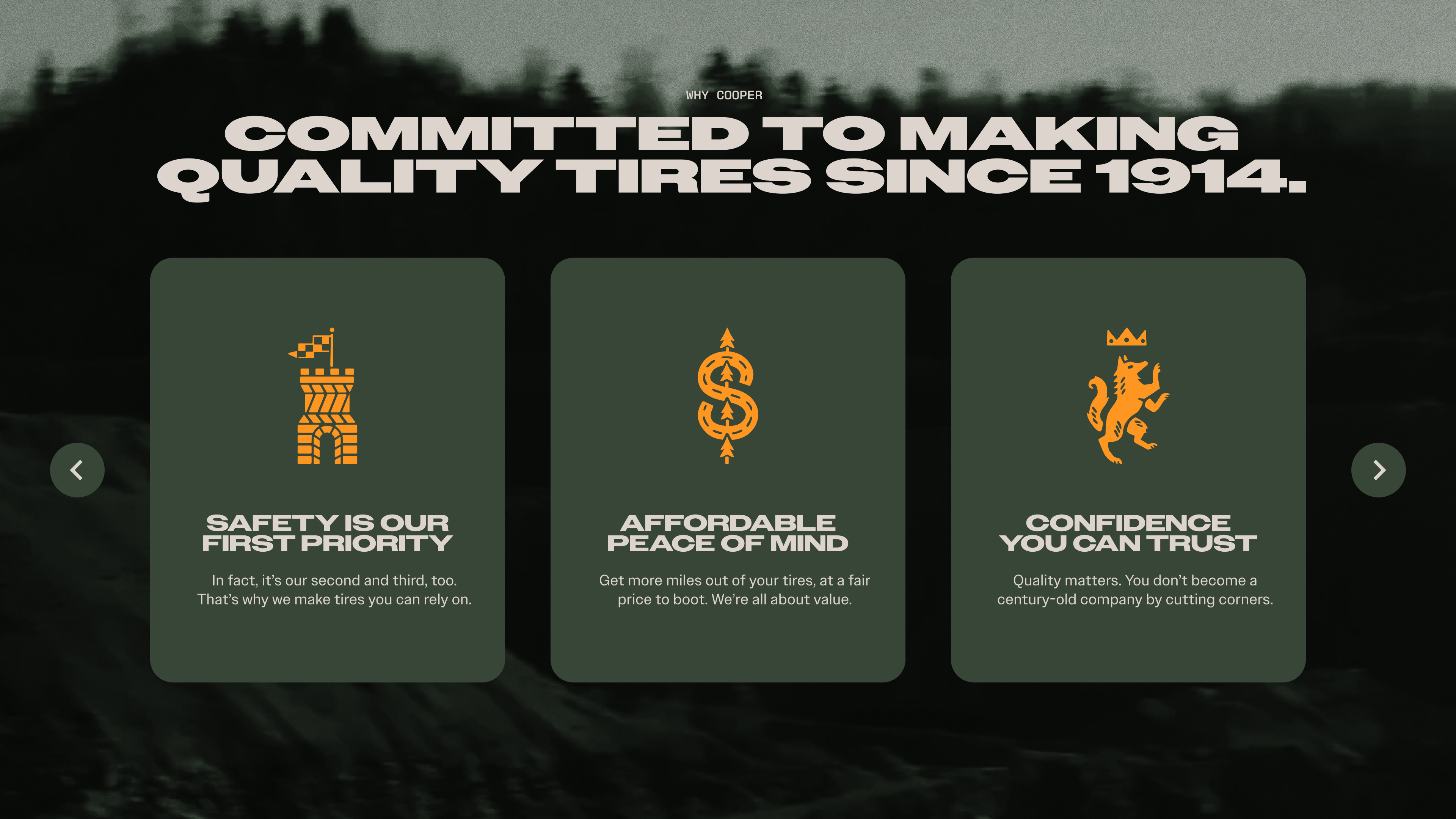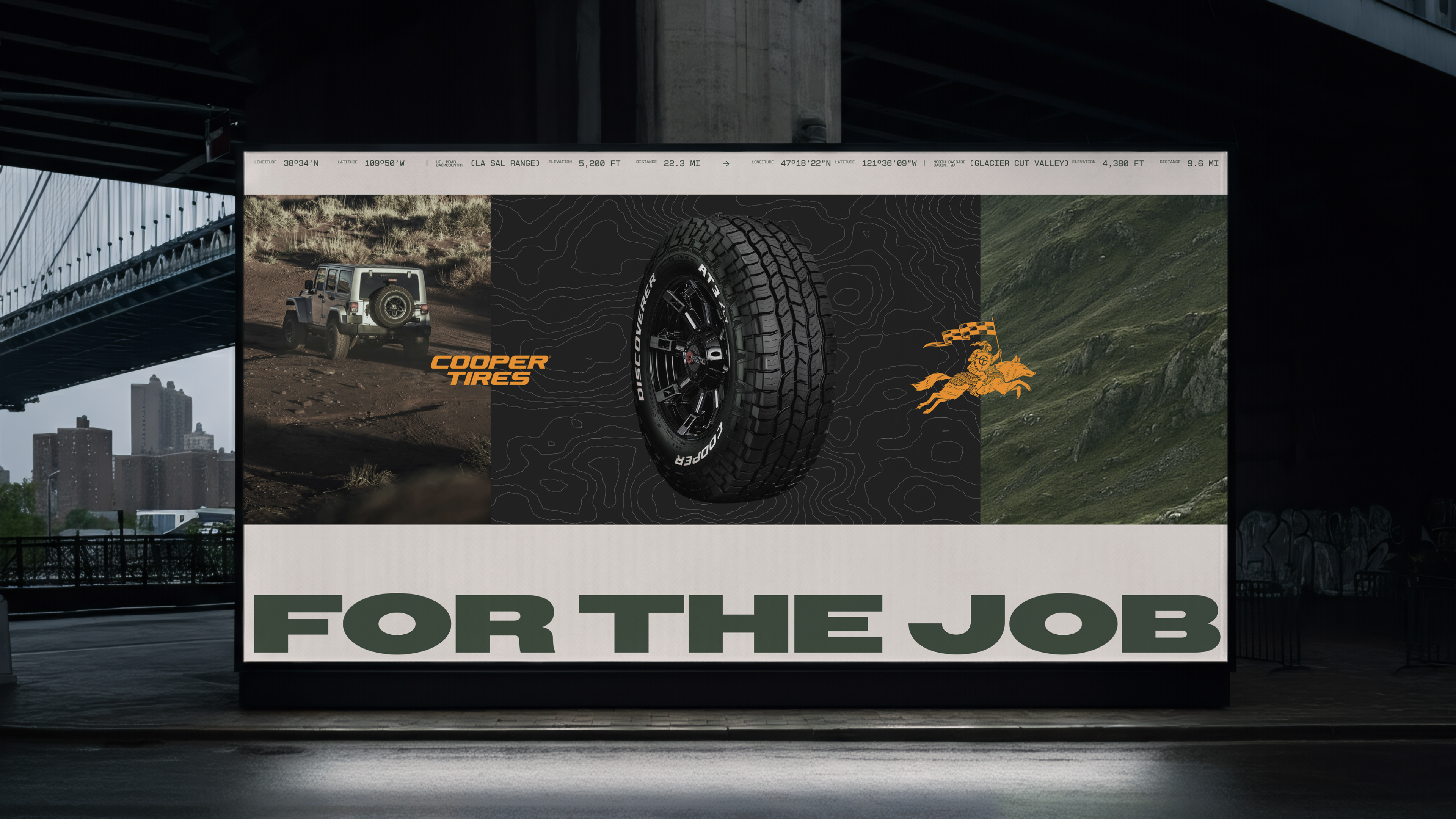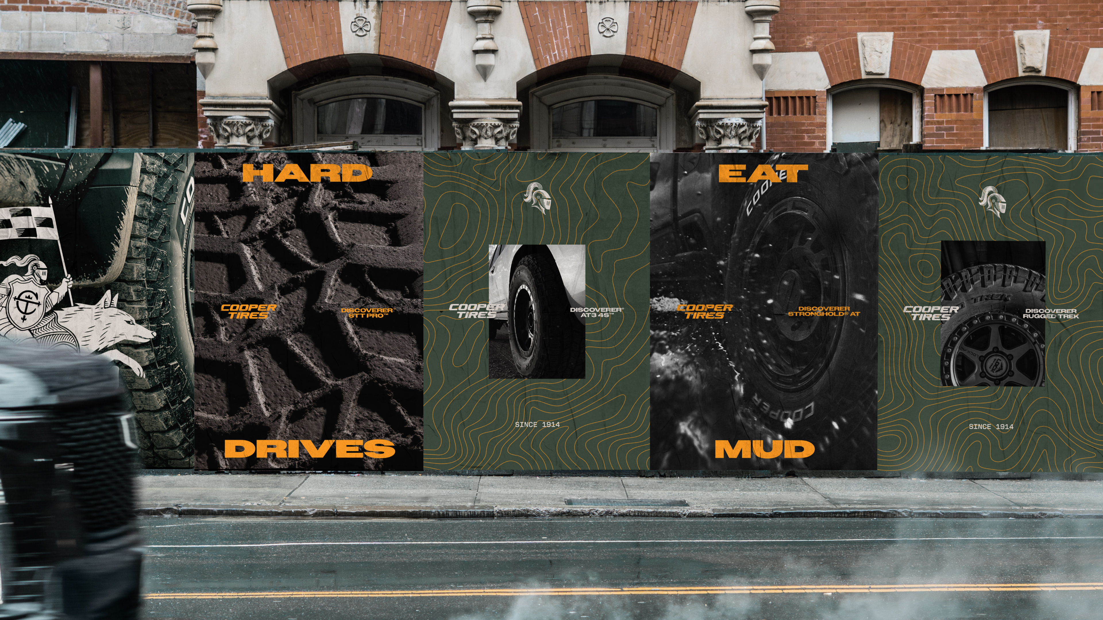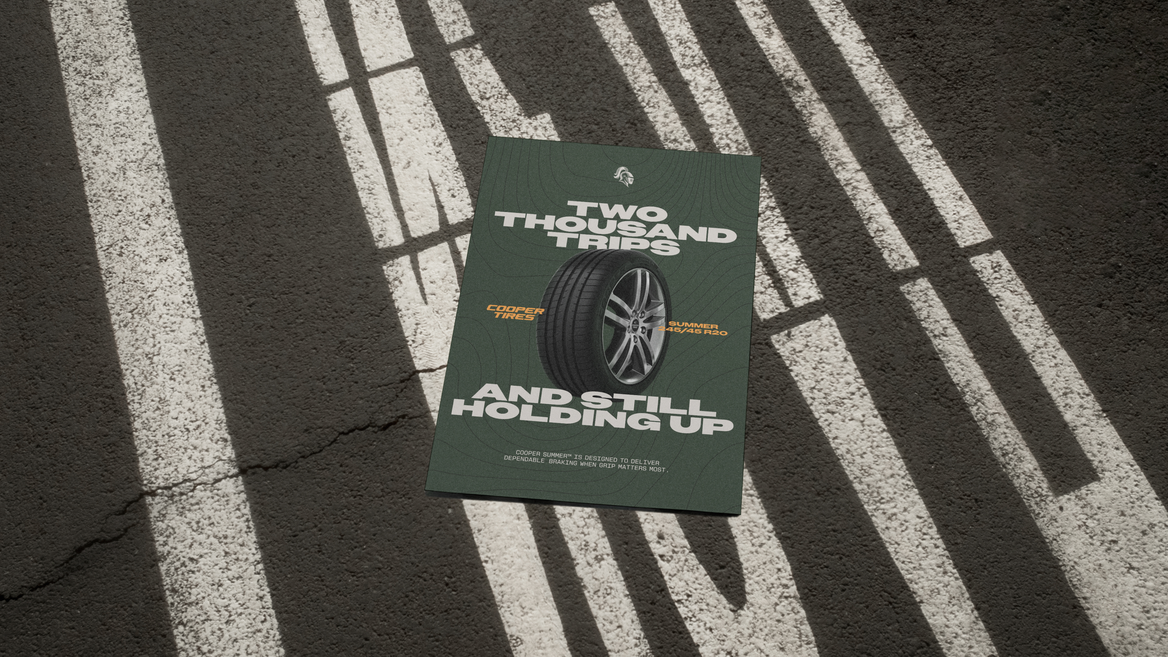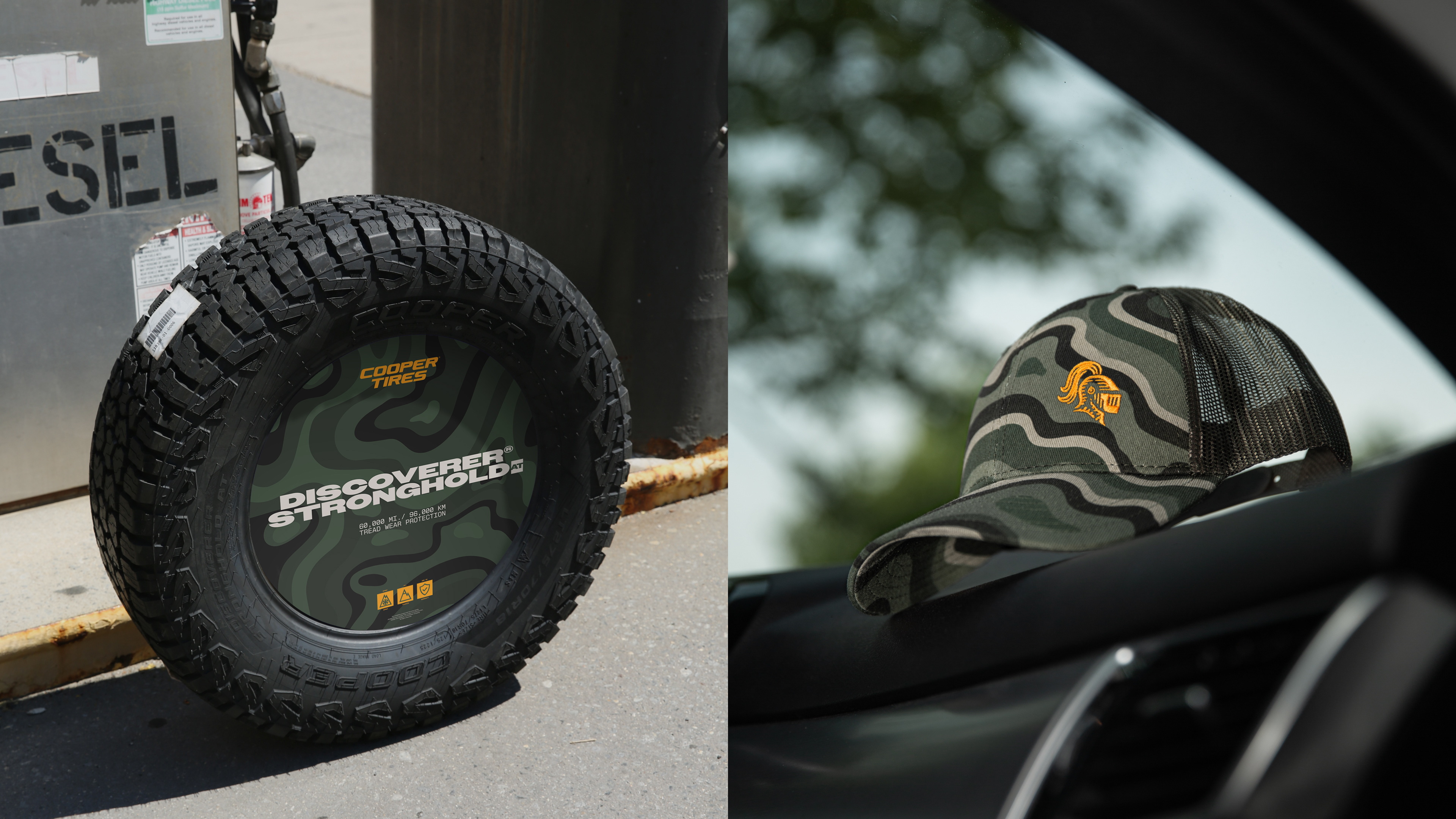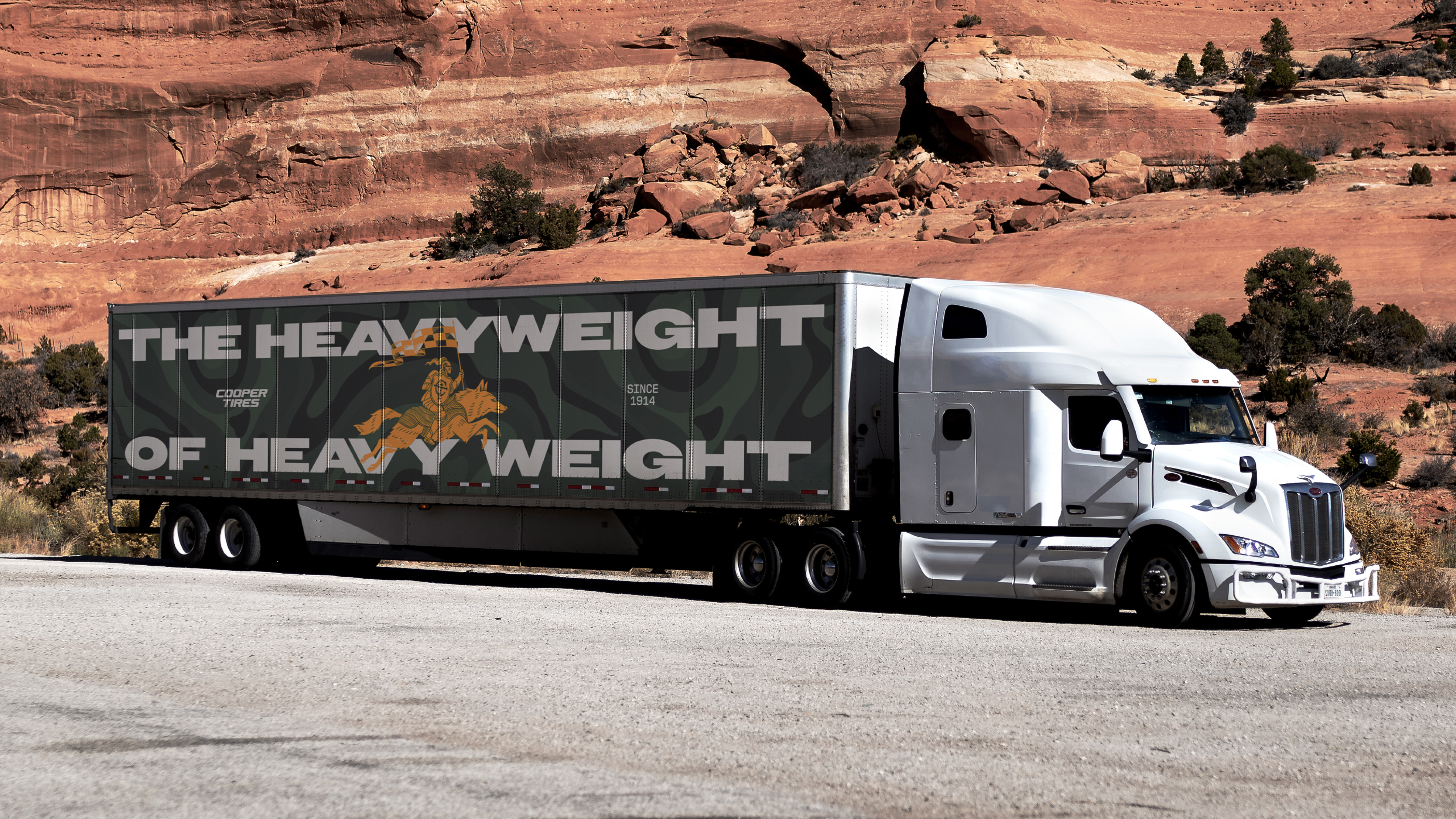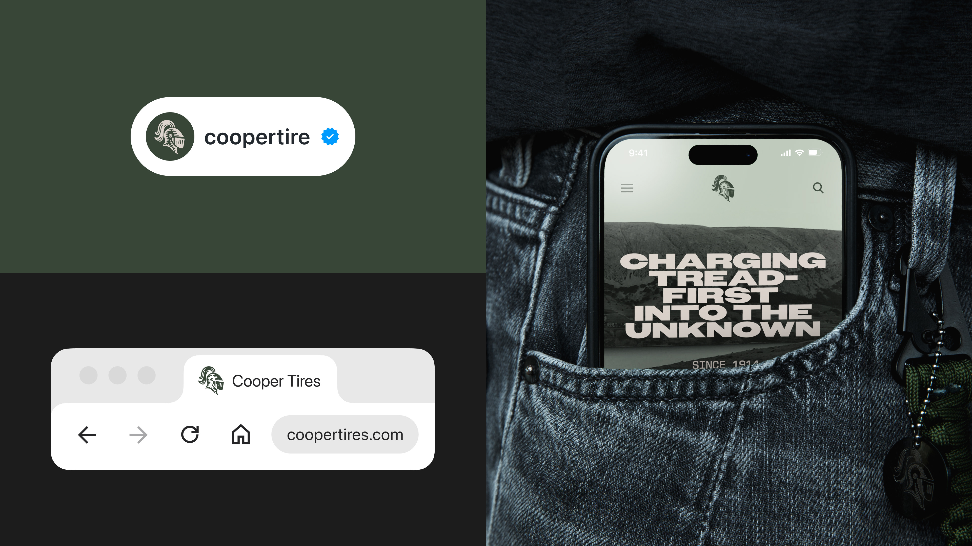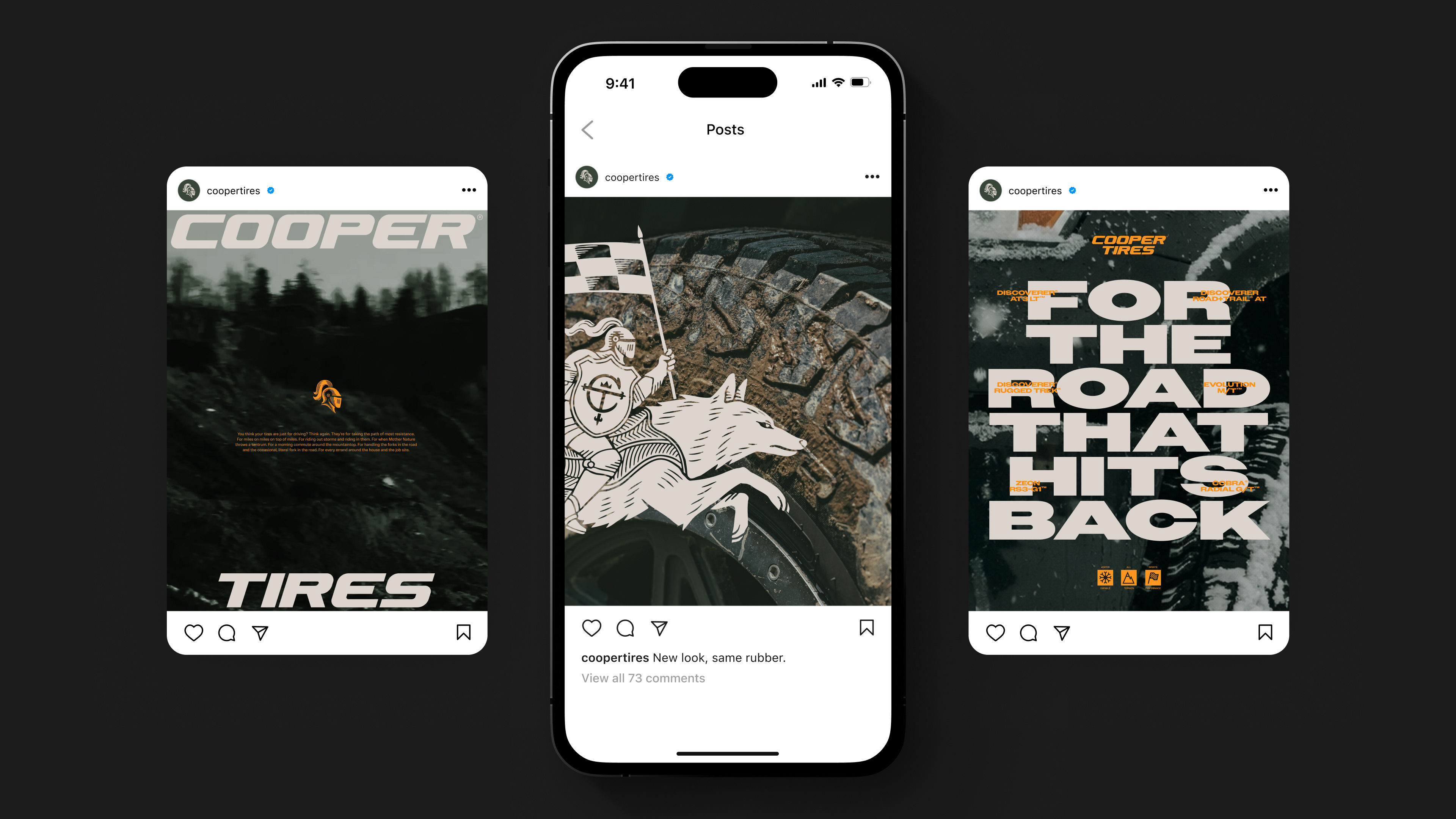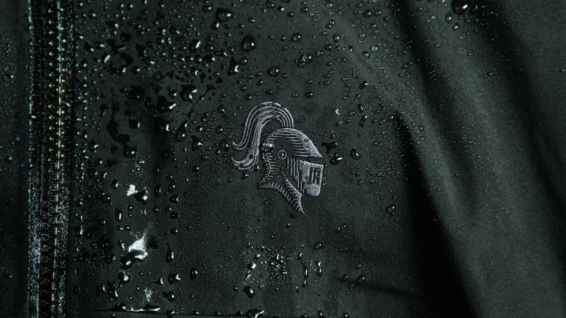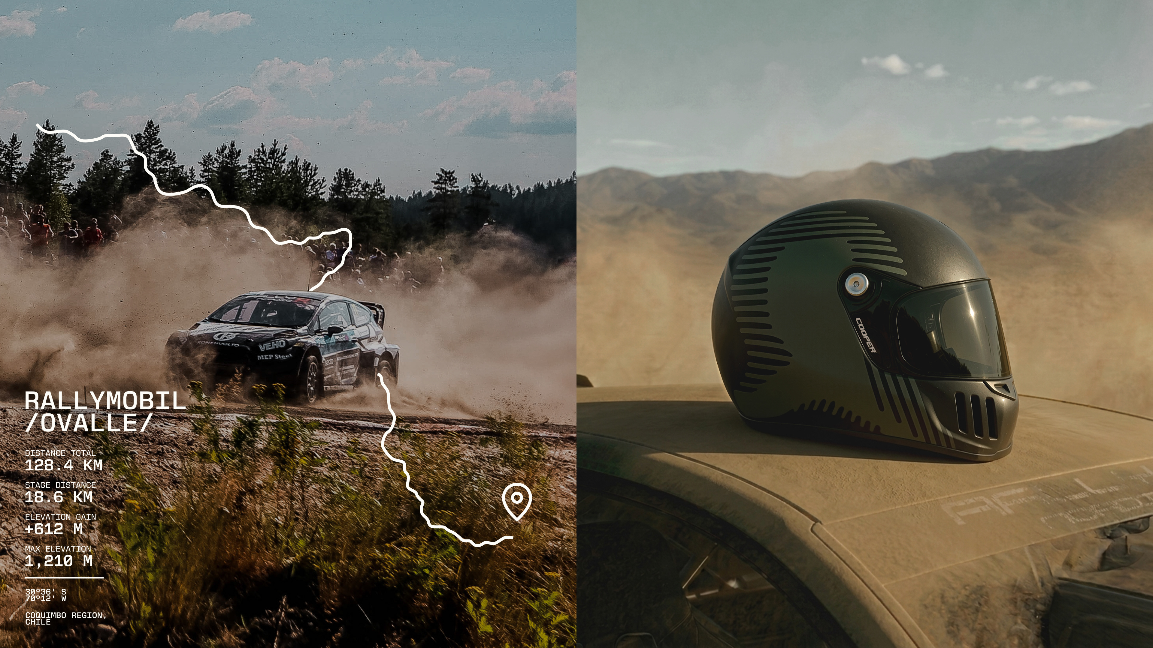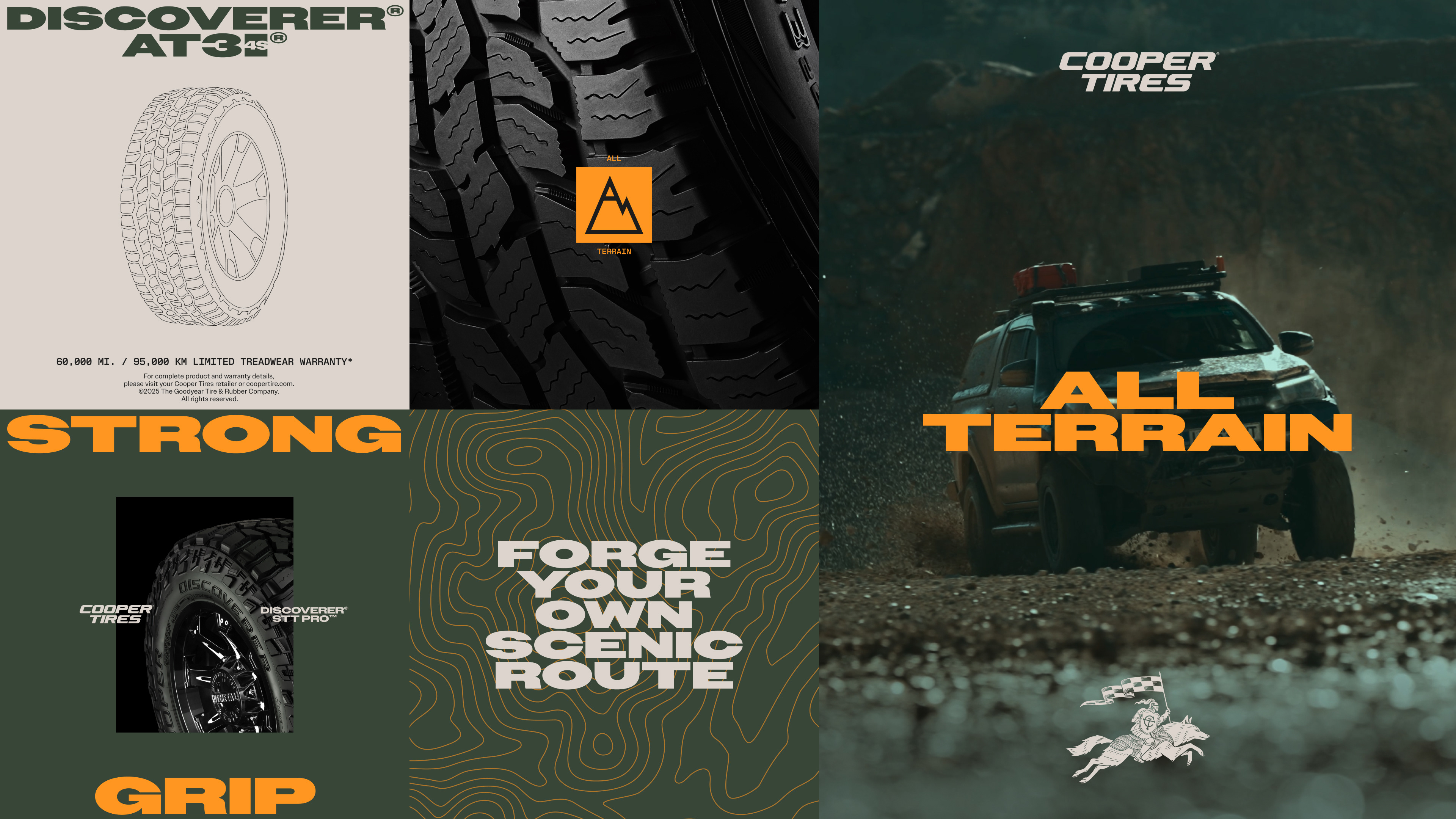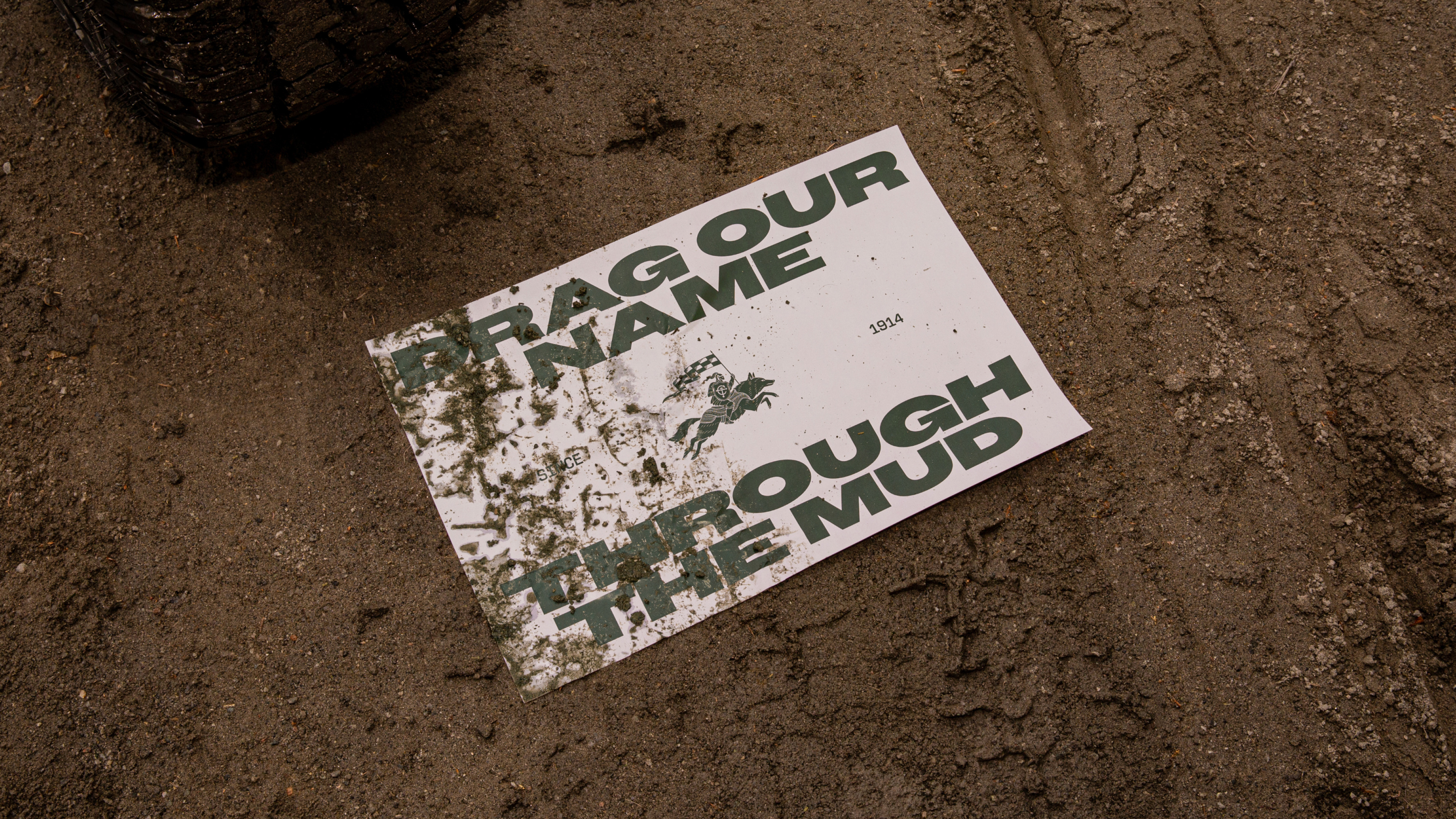
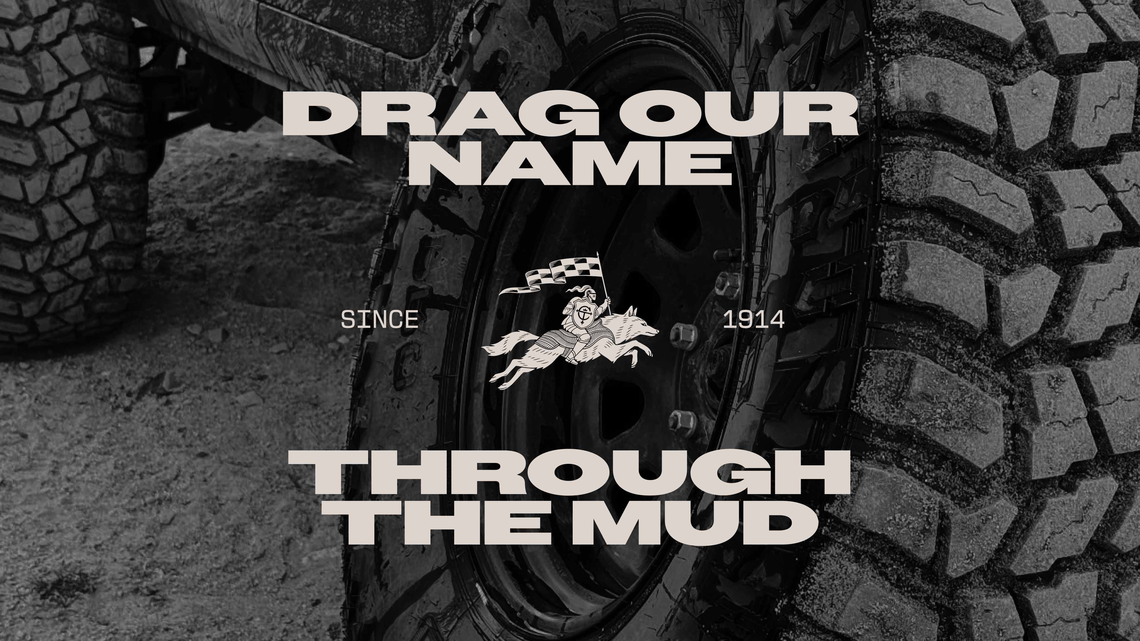
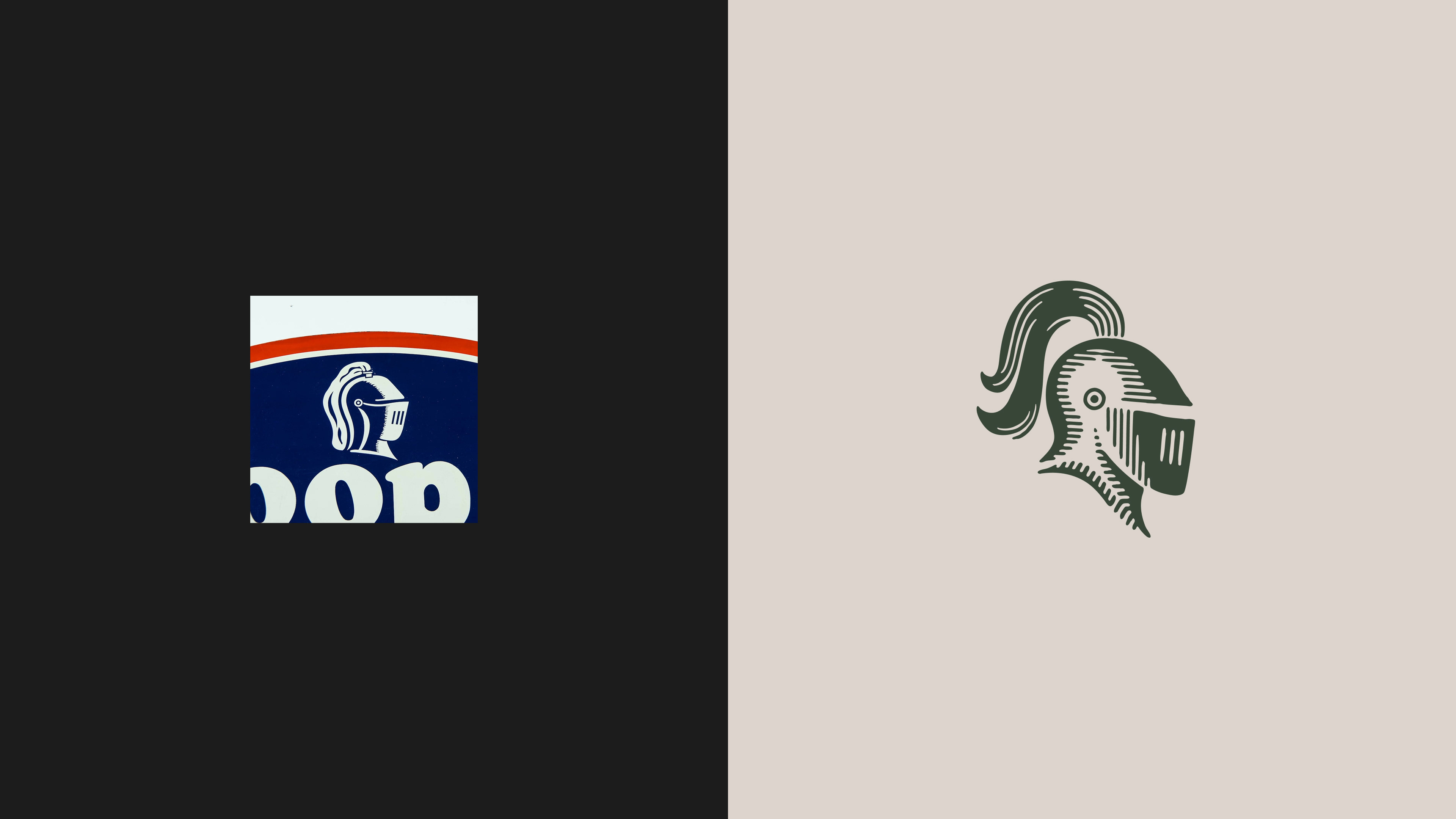
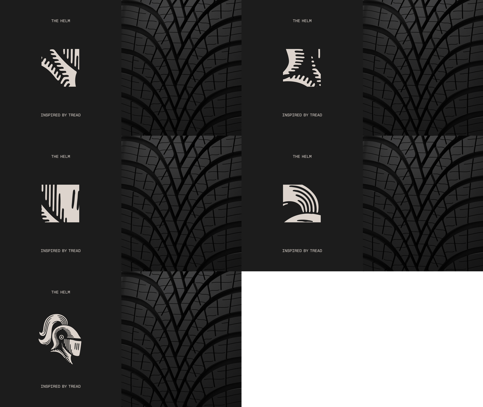
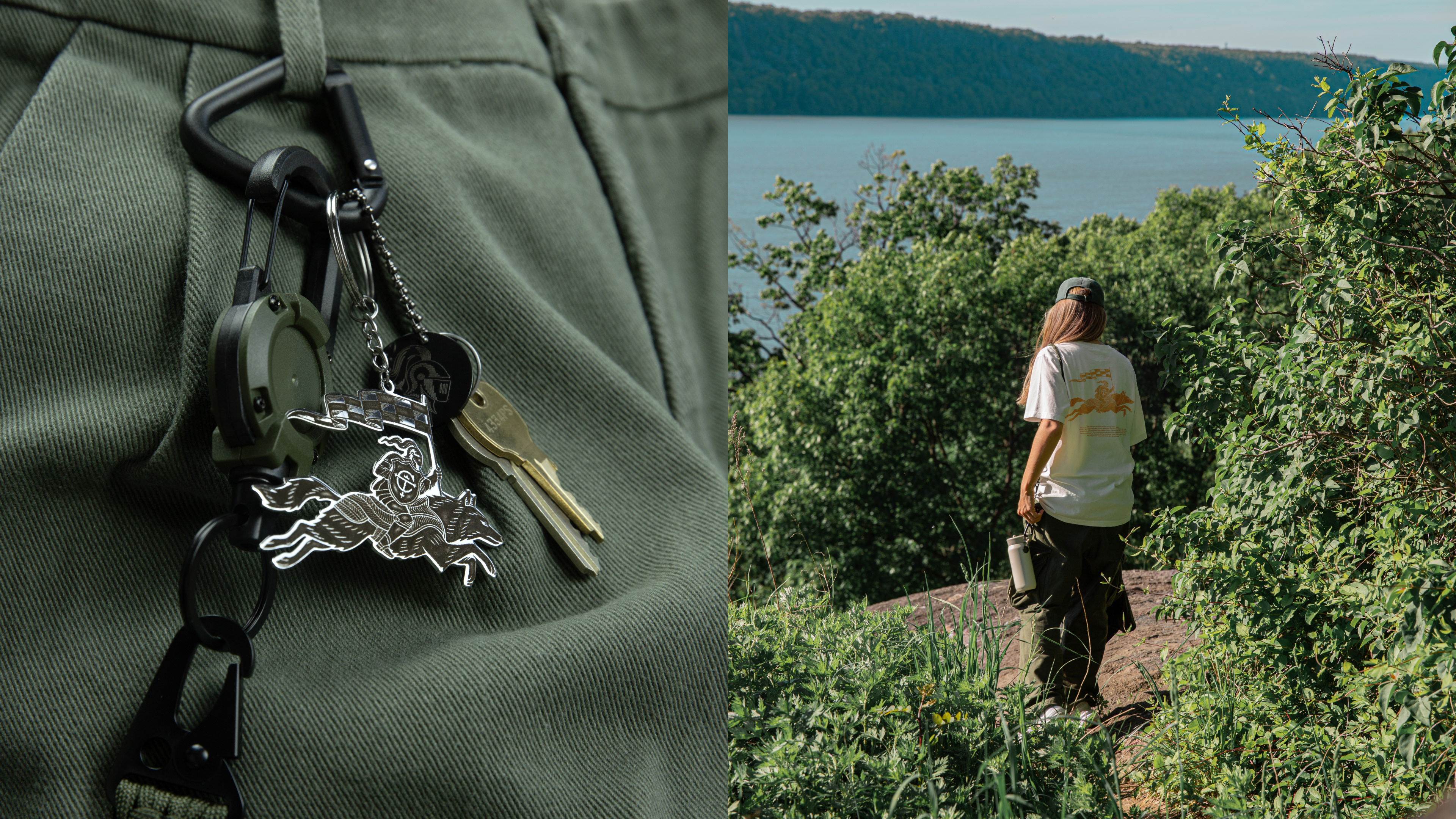
You don’t often get the opportunity to reinvent a globally established brand. Working alongside a talented team of designers and art director Ryan Atkinson, Marco helped reimagine the visual world of Cooper Tires. Transforming what was once a bland, forgettable identity into something far more rugged, adventurous, and full of character. Inspired by the aggressive tread patterns and groove designs of Cooper tyres, the refreshed HELM logo was crafted with an old-school woodcut print aesthetic, bringing a sense of grit, toughness, and authenticity to the brand. Alongside the identity refresh, a series of bold brand illustrations and visual assets helped build out a more cohesive and distinctive world for Cooper Tires.

Color
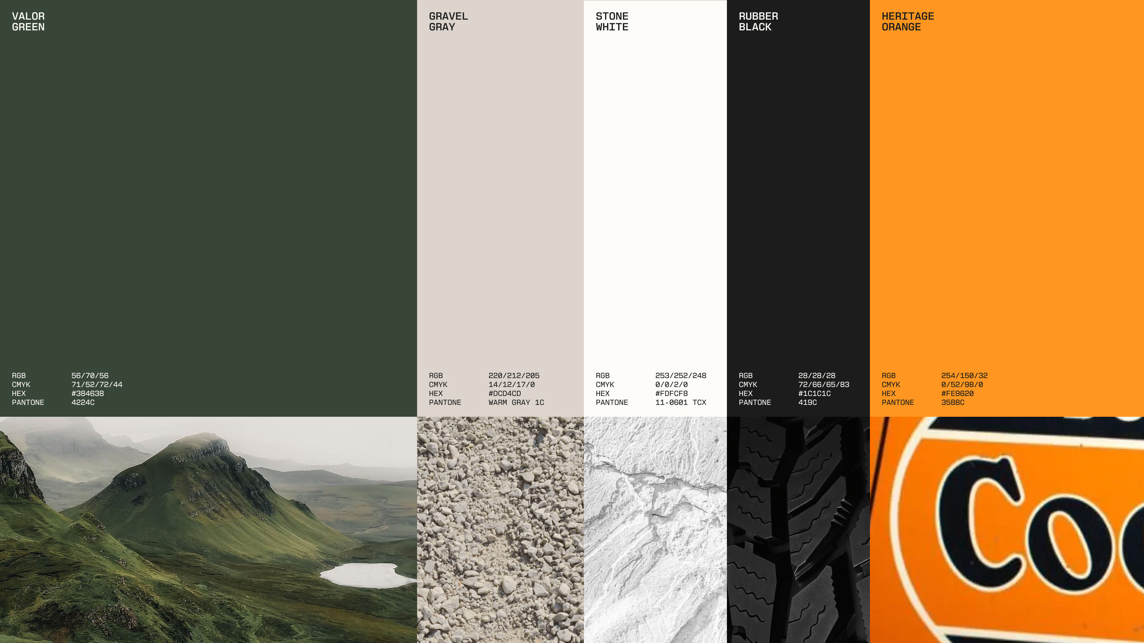
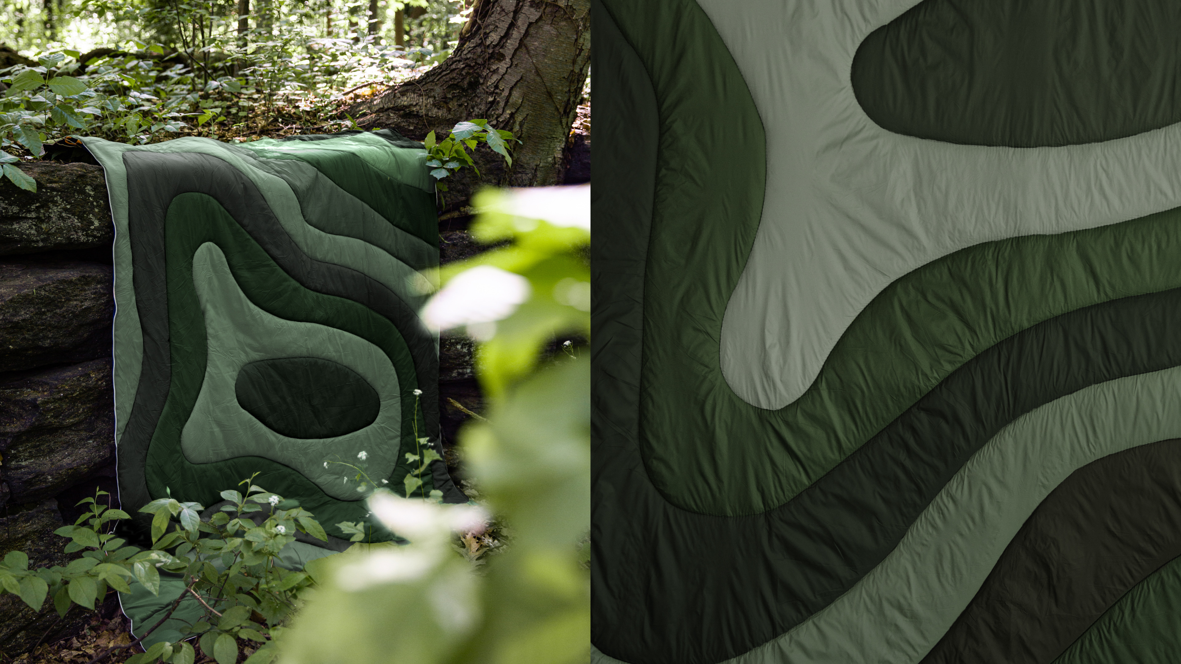
The palette is led by Valor Green–a color that sets Cooper apart in a category of familiar tones, and points to exactly where its toughest all-terrain tires are made to go: off the road and into the wild. A heritage orange accent carries the brand's early character through.
The palette is led by Valor Green–a color that sets Cooper apart in a category of familiar tones, and points to exactly where its toughest all-terrain tires are made to go: off the road and into the wild. A heritage orange accent carries the brand's early character through.